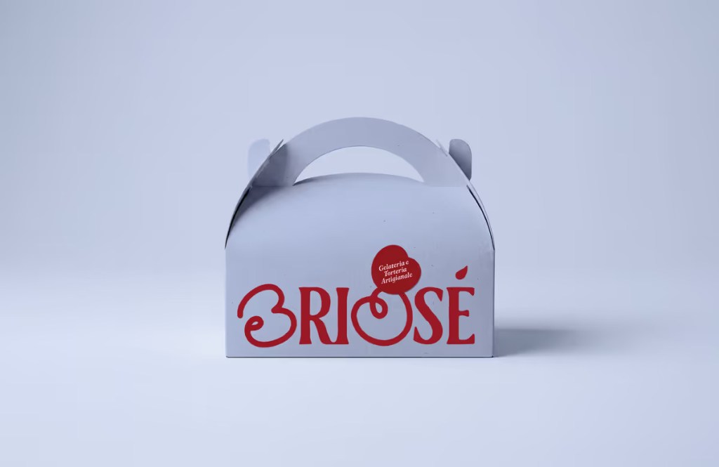
When sisters Elisa and Elena founded Briosé, an artisanal gelato and pastry shop, they needed a visual identity as delightful as their confections. The resulting design project successfully captures the multifaceted nature of their business—from single-portion desserts and artisan gelato to custom cakes and special events—creating a contemporary and inviting brand presence.
A Logo with Personal Touches
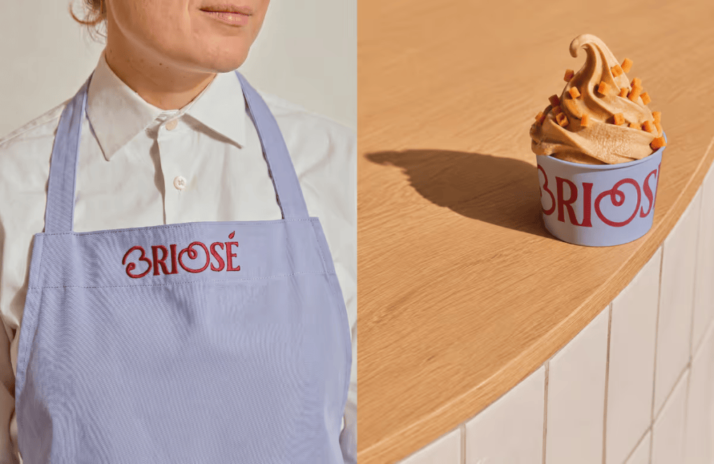
At the heart of Briosé’s identity is a carefully crafted logo that balances refinement with spontaneity. The design pairs a structured serif wordmark with thoughtful, custom modifications. The letters B and O were reshaped into soft, circular forms inspired by cherries. These customised letters not only nod to the world of sweets but also cleverly represent the two founding sisters. This detail transforms the logotype into a highly memorable, standalone symbol for the brand.
A Palette Good Enough to Eat
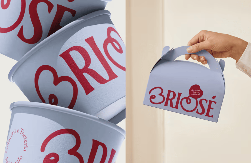
The visual language leans heavily on a colour palette designed to evoke warmth, freshness, and immediate appetite appeal:
- Cherry Red: Serves as the brand’s vibrant, signature accent.
- Cream and Buttery Tones: Evoke the comforting essence of vanilla, pastry dough, and classic bakery packaging.
- Soft Lilac Blue: Introduces a light, contemporary contrast.
- Dark Neutral: Grounds the palette by adding necessary depth and readability.
Complementing these colours is a typographic pairing of Fraunces and Lora. Together, they establish a brand voice that is elegant yet approachable, boasting a subtle retro character that perfectly aligns with Briosé’s artisanal roots.
Flexible and Organic Design Elements
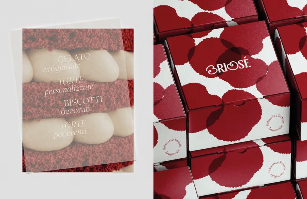
Moving beyond the logo, the wider visual identity embraces soft, irregular shapes inspired by the natural imperfections of handmade goods and scoops of gelato. These graphic elements are highly modular—they overlap, intersect, and scale dynamically. Depending on how they are used, they can subtly mimic flowers, cherries, or abstract textures, ensuring the branding remains cohesive without ever feeling repetitive.
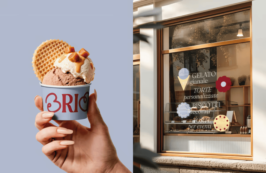
Applied across a variety of touchpoints—including gelato cups, pastry boxes, menus, storefront signage, and digital platforms—the Briosé identity reimagines traditional pastry shop aesthetics. The result is a highly distinctive food branding system that wraps every product and occasion in the same warm, artisanal charm.
 Capitan Studios