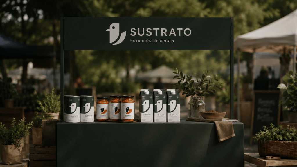
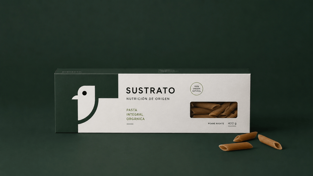
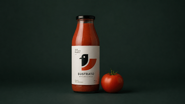
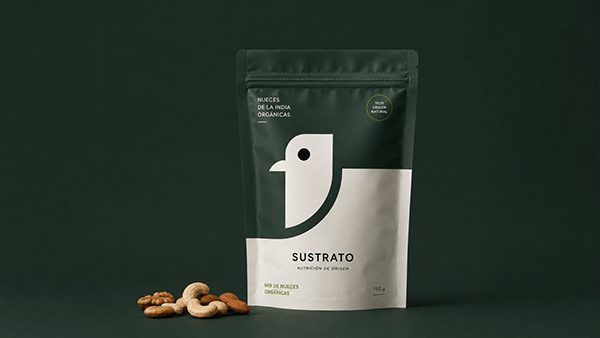
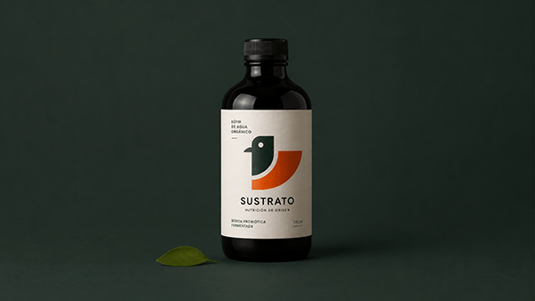
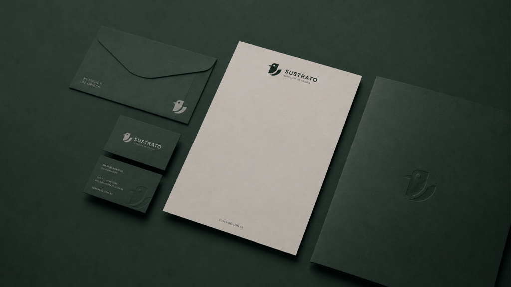
Sustrato stands out as a visual identity concept for a contemporary organic food brand, built around a simple yet powerful premise: communicating nutrition, origin, quality, and trust without relying on conventional rustic or handcrafted visual tropes. Instead, the project offers a refined and modern interpretation of natural food culture.
The visual system seamlessly integrates minimalist branding, functional packaging, natural materials, and a thoughtfully curated photographic style. Every element is crafted to feel intentional, authentic, and approachable, delivering a cohesive brand experience. Clean compositions, generous negative space, subtle textures, and a rich palette inspired by nature come together to create a visual atmosphere that is both sophisticated and deeply grounded.
From its packaging and print collateral to its digital touchpoints and photography, Sustrato consistently reinforces core principles of clarity, honesty, and simplicity. Ultimately, it is a brand identity designed to feel transparent, modern, and memorable—effortlessly connecting today’s consumers with the true natural origin of their food.
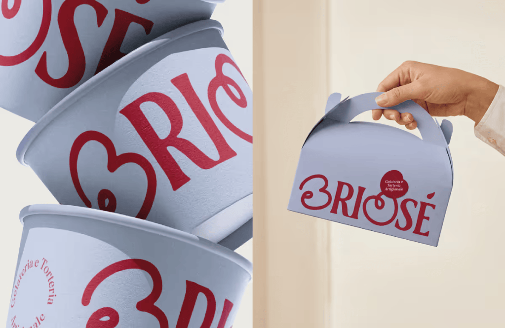
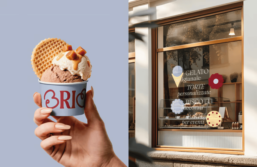
When sisters Elisa and Elena founded Briosé, an artisanal gelato and pastry shop, they needed a visual identity as delightful as their confections. The resulting design project successfully captures the multifaceted nature of their business—from single-portion desserts and artisan gelato to custom cakes and special events—creating a contemporary and inviting brand presence.
A Logo with Personal Touches
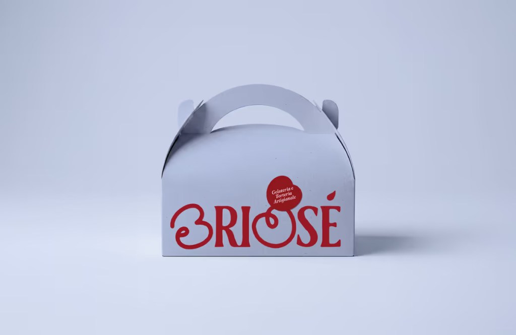
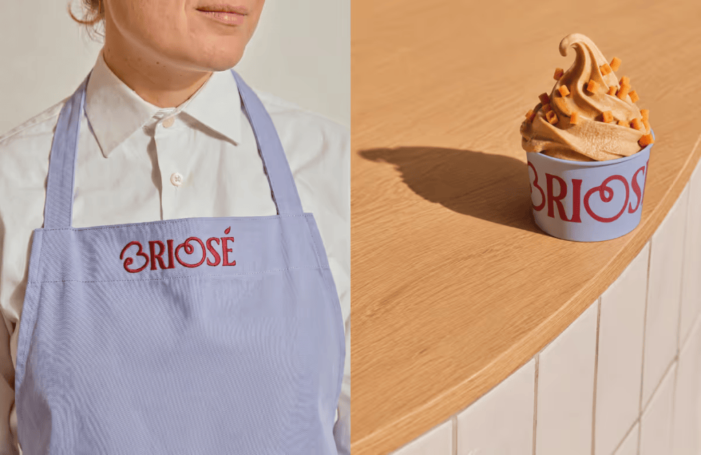
At the heart of Briosé’s identity is a carefully crafted logo that balances refinement with spontaneity. The design pairs a structured serif wordmark with thoughtful, custom modifications. The letters B and O were reshaped into soft, circular forms inspired by cherries. These customised letters not only nod to the world of sweets but also cleverly represent the two founding sisters. This detail transforms the logotype into a highly memorable, standalone symbol for the brand.
A Palette Good Enough to Eat
The visual language leans heavily on a colour palette designed to evoke warmth, freshness, and immediate appetite appeal:
Cherry Red: Serves as the brand’s vibrant, signature accent.
Cream and Buttery Tones: Evoke the comforting essence of vanilla, pastry dough, and classic bakery packaging.
Soft Lilac Blue: Introduces a light, contemporary contrast.
Dark Neutral: Grounds the palette by adding necessary depth and readability.
Complementing these colours is a typographic pairing of Fraunces and Lora. Together, they establish a brand voice that is elegant yet approachable, boasting a subtle retro character that perfectly aligns with Briosé’s artisanal roots.
Flexible and Organic Design Elements
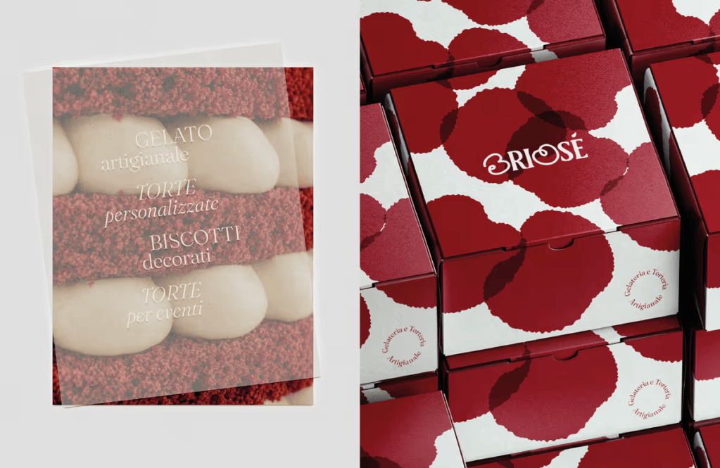
Moving beyond the logo, the wider visual identity embraces soft, irregular shapes inspired by the natural imperfections of handmade goods and scoops of gelato. These graphic elements are highly modular—they overlap, intersect, and scale dynamically. Depending on how they are used, they can subtly mimic flowers, cherries, or abstract textures, ensuring the branding remains cohesive without ever feeling repetitive.
Applied across a variety of touchpoints—including gelato cups, pastry boxes, menus, storefront signage, and digital platforms—the Briosé identity reimagines traditional pastry shop aesthetics. The result is a highly distinctive food branding system that wraps every product and occasion in the same warm, artisanal charm.
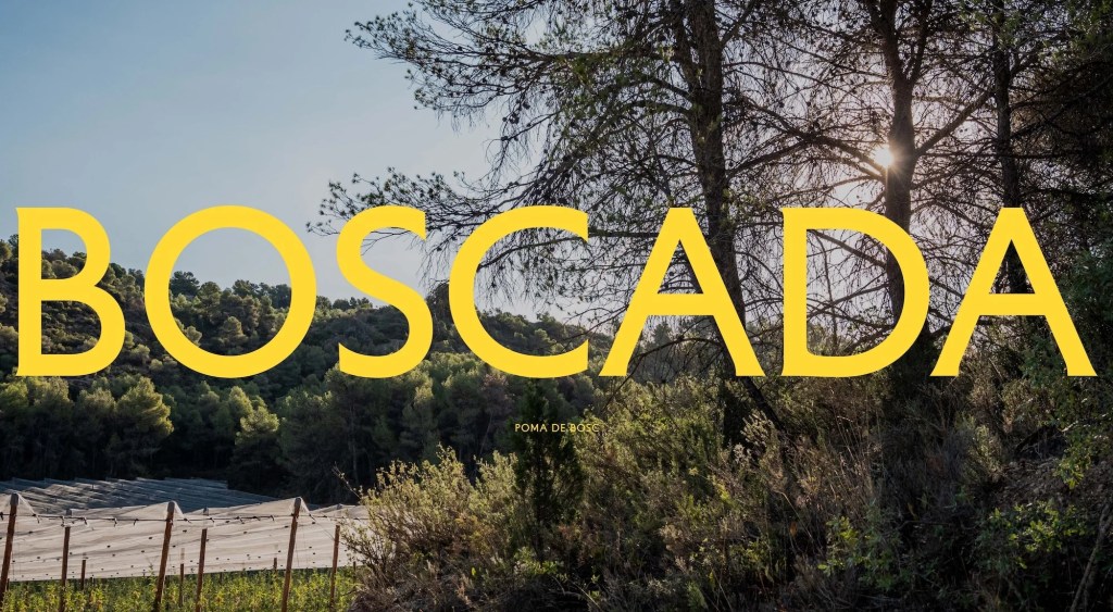
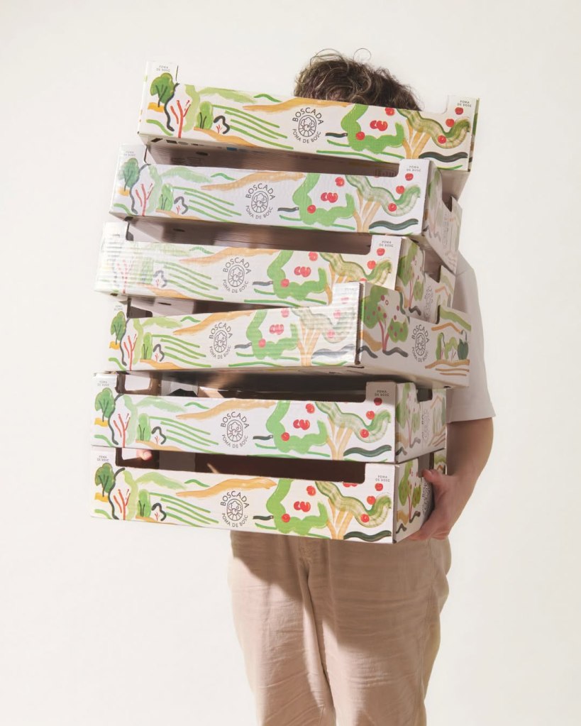
Barcelona-based design studio Plakton recently cultivated a rich, narrative-driven identity for Boscada, a new apple brand. The brand belongs to Baró i Fills, a family-owned agricultural company with over 50 years of experience growing stone and pome fruits. While the family has a long, established history in farming, Boscada marks the very first time they have produced and marketed apples under their own standalone brand.
Rooted in Family Memory
The foundation of Boscada’s identity stems from a poignant family memory. It traces back to Bellaguarda, described by the family as “where our grandfather used to go”—a high-altitude location defined by remote farms nestled within surrounding forests.
The brand name itself draws from the Catalan word emboscada, evoking the feeling of being enveloped by the woods while simultaneously hinting at a highly sought-after apple. According to brand strategist Gerard Condal, the team chose to anchor the identity in the landscape where the apples grow. The strategy was to create a brand that reveals its deeper layers over time, rewarding those who discover the story behind the fruit rather than explaining everything at first glance.
A Symbol of the Terrain
Boscada’s offerings—specifically the Golden, Fuji, and Granny Smith varieties—are cultivated at an impressive elevation of approximately 1,000 metres above sea level, a terrain that gives the fruit its special characteristics. This unique environment was distilled directly into the brand’s symbol.
Rather than relying on literal depictions of mountains or trees, the logo elegantly folds the imagery of an apple, rolling fields, and the surrounding woodland into a single, abstract graphic. Art Director Roser Padrés explains that this level of abstraction ensures the mark serves as a timeless, highly functional identifier that can be reproduced even at minimal sizes without becoming overly descriptive.
The Balance of Nature and Precision
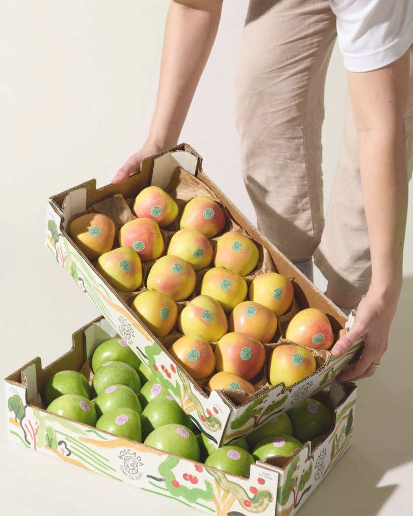
To contrast the clean, structured symbol, Plakton introduced a secondary visual language utilising expressive watercolours. Designed as one massive composition, the artwork is cropped into distinct fragments for various touchpoints—from packaging boxes to social media. Because of this, every piece of communication features a unique slice of the same visual universe. The symbol identifies the product on the label, while the boxes immerse the buyer in the Boscada world.
Padrés notes that while the illustrations capture the spontaneous, organic nature of the environment, the brand’s typography and layout remain intentionally restrained. This duality perfectly mirrors the product: nature is wild and spontaneous, but cultivating exceptional fruit at 1,000 metres requires immense care, experience, and precision.
For typography, the studio paired Matthieu Cortat’s warm Petit Serif with Hoefler & Co.’s Sentinel, a Clarendon-inspired slab serif. The former provides an elegant, distinct personality that ties into the brand’s emotional core without feeling nostalgic, while the latter delivers crisp clarity for longer texts and digital applications.
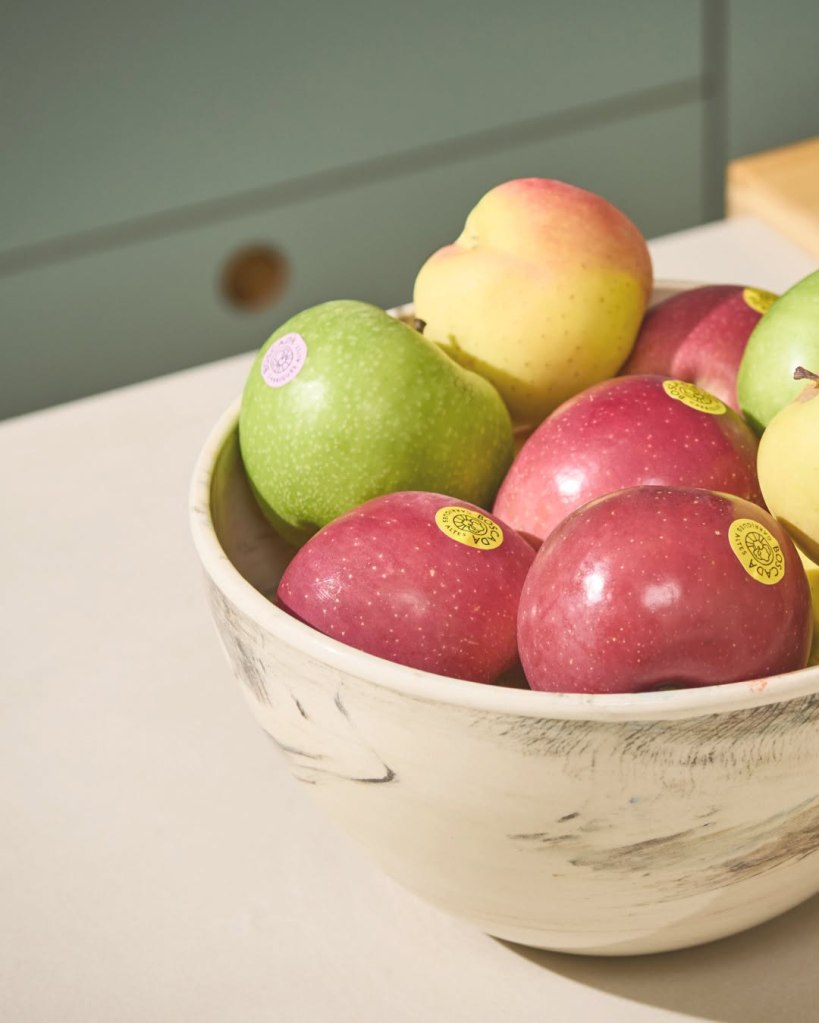
Finally, the packaging employs a functional colour system for the labels to distinguish the three apple varieties. Applied directly to the fruit, these colours were carefully calibrated to contrast with the apple skin, ensuring each variety is instantly recognisable while remaining perfectly at home within the broader Boscada aesthetic.
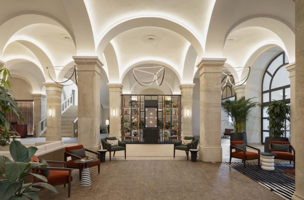
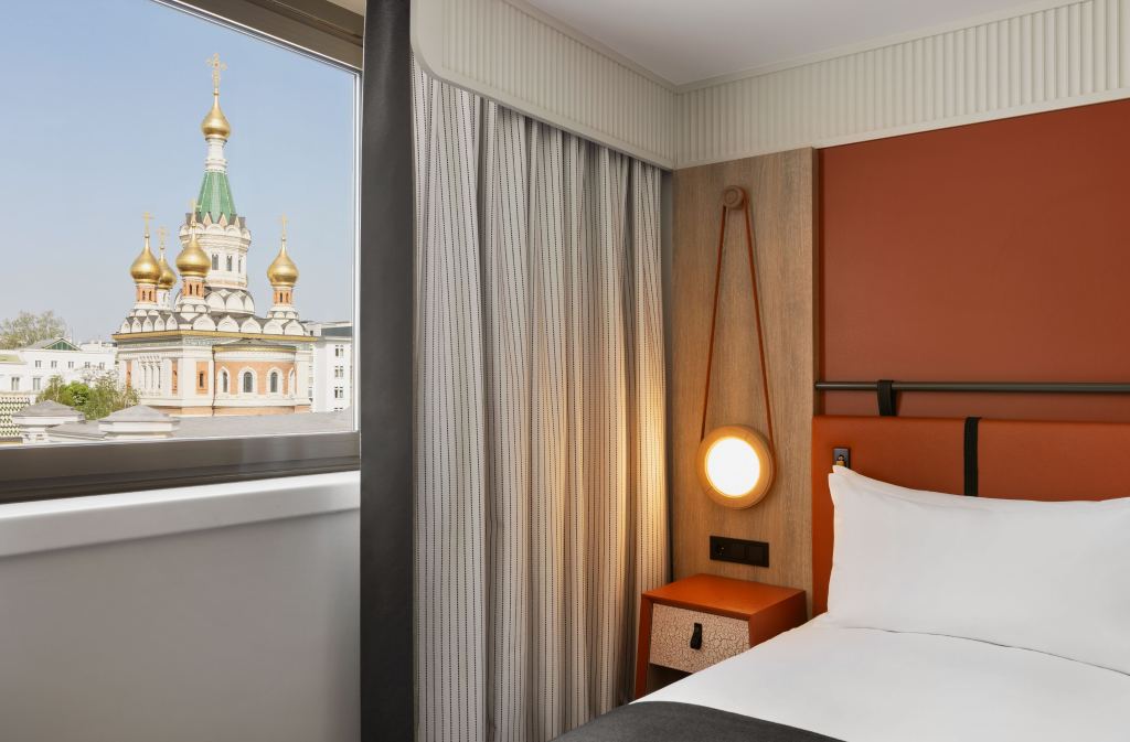
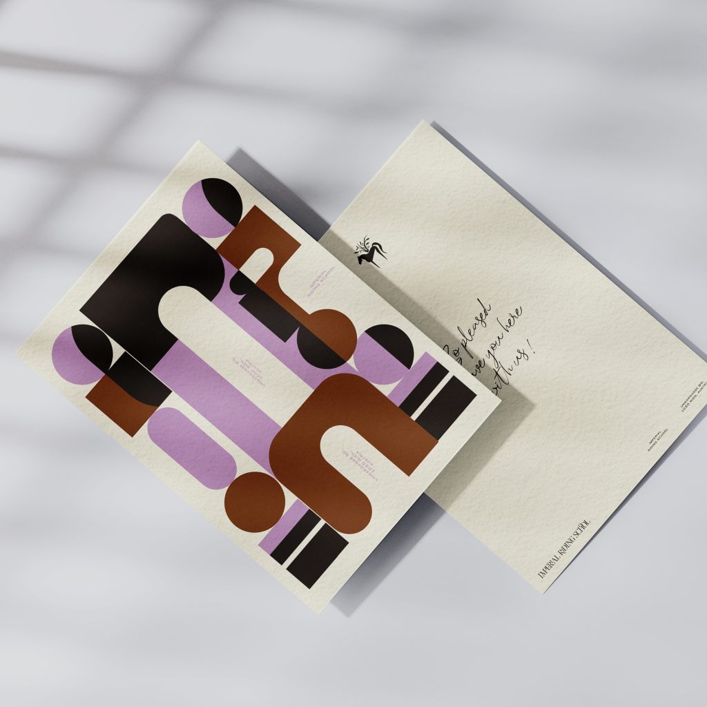
Vienna is traditionally celebrated for its relaxed pace of life, profound historical roots, classical music, and overall tranquillity. However, the newly completed Imperial Riding School hotel tells a decidedly different story.
Nestled in Landstraße, the hotel resides in a neighbourhood boasting a lively bohemian vibe, where a vibrant creative community exists side-by-side with numerous formal embassies. It is an area undergoing an exciting rejuvenation, making it a highly dynamic place to experience the city.
A Building with a Quirky Past
The building itself perfectly reflects the unique character of its surroundings. Over the years, the structure has continuously reinvented itself, serving past lives as a grand palace, a riding school, an old cinema, and even a bus station.
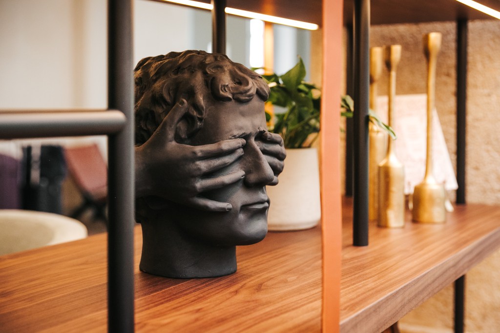
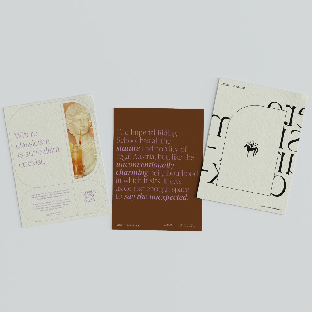
Today, the Imperial Riding School retains all the stature and nobility of regal Austria. Yet, much like its unconventionally charming neighbourhood, the design deliberately leaves room for the unexpected. The result is a beautifully unconventional story of formality, balancing classic elegance with modern quirks.
Project Scope & Services
To bring this unique hospitality brand to life, a comprehensive suite of creative and strategic services was executed:
Brand Strategy & Identity: Crafting the core narrative and visual essence of the hotel.
Brand Activation & Experience Design: Ensuring the brand story translates seamlessly into the guest experience.
Interior Consultancy: Aligning the physical spaces with the overarching bohemian-meets-regal concept.
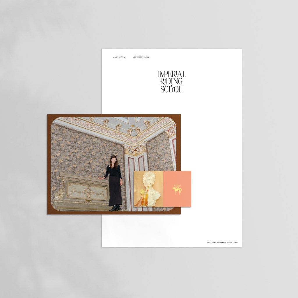
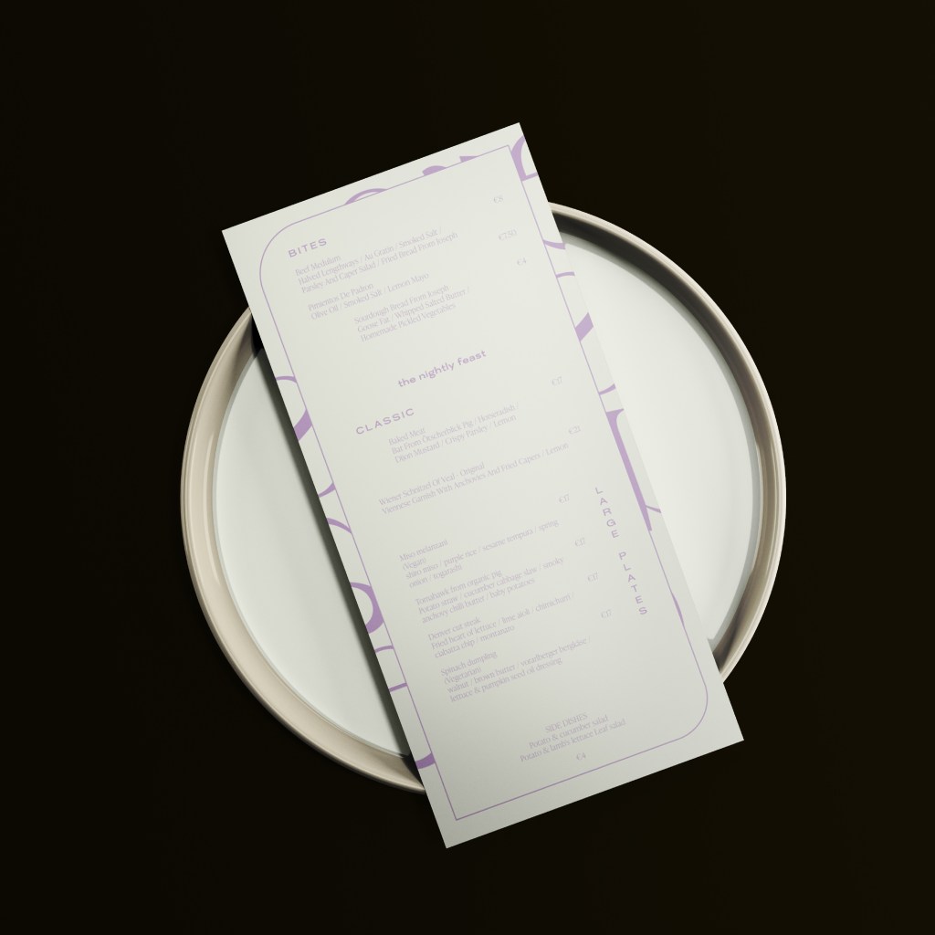
Digital & Print: Full website design and development alongside bespoke print collateral design.
Photography: Capturing the revitalised space and its distinctive atmosphere.
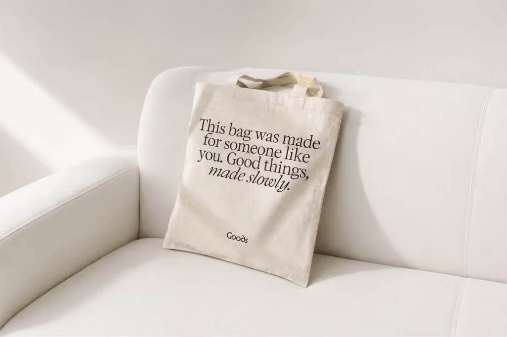
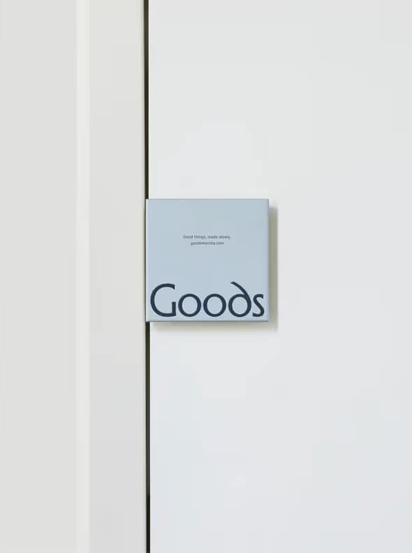
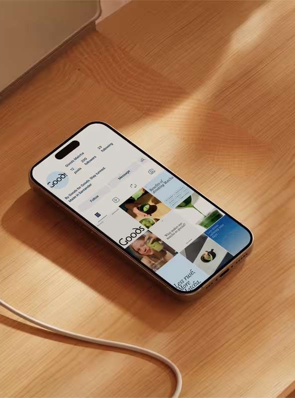
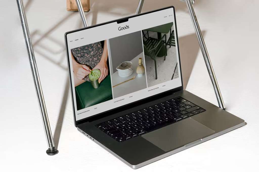
Goods is a premium Japanese matcha brand founded on a simple but powerful philosophy: quality should be felt before it is ever tasted. With a mission to introduce ceremonial-grade matcha to a discerning European audience, they needed a brand identity strong enough to communicate this promise across retail, packaging, and digital touchpoints.
The Challenge
Our brief was a balancing act of two distinct cultures. We needed to honour the deep, authentic roots of Japanese tea craftsmanship while positioning Goods as a modern, premium lifestyle brand for the European market. The identity had to feel refined without feeling cold, and authentic without leaning on nostalgic clichés.
Our Strategy
When we audited the existing matcha market, we found two extremes: brands were either hyper-traditional or lost in a sea of generic wellness aesthetics. Our opportunity was to build a brand that lived beautifully in the space between—rooted in Japanese visual philosophy but speaking the sleek language of contemporary European design.
We anchored the identity in the concept of “deliberate stillness.” Emulating the meditative nature of a traditional matcha ritual, we ensured that every design decision—from spatial composition to typographic weight—was highly intentional. Nothing is accidental; nothing is excessive.
The Visual System
Colour Palette: Inspired by the product itself, we utilised natural matcha tones—deep greens, warm off-whites, and muted earth tones that communicate purity and origin.
Typography & Space: We chose minimal, precise typography with generous spacing to create visual “breathing room” and project quiet confidence.
Form: Organic shapes and soft geometry subtly nod to the handcrafted nature of the tea, avoiding heavy-handed or literal illustrations.
The Outcome
The resulting identity is flexible, cohesive, and timeless. Whether on primary packaging or a digital storefront, the brand maintains a consistent “visual temperature.” Since launching, Goods has deeply resonated with consumers who value craft, origin, and intentional living, and the brand is now successfully expanding its retail footprint across Europe.