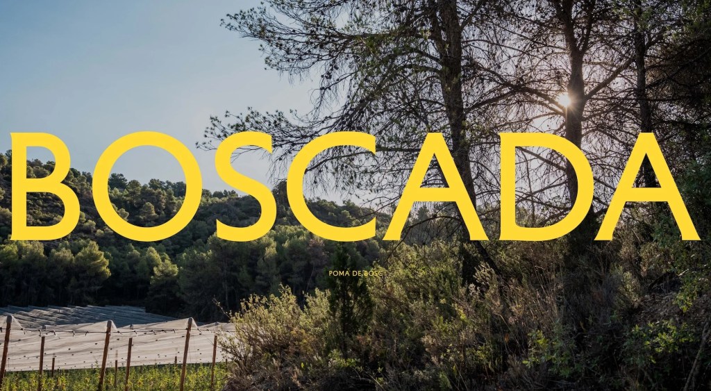
Barcelona-based design studio Plakton recently cultivated a rich, narrative-driven identity for Boscada, a new apple brand. The brand belongs to Baró i Fills, a family-owned agricultural company with over 50 years of experience growing stone and pome fruits. While the family has a long, established history in farming, Boscada marks the very first time they have produced and marketed apples under their own standalone brand.
Rooted in Family Memory
The foundation of Boscada’s identity stems from a poignant family memory. It traces back to Bellaguarda, described by the family as “where our grandfather used to go”—a high-altitude location defined by remote farms nestled within surrounding forests.
The brand name itself draws from the Catalan word emboscada, evoking the feeling of being enveloped by the woods while simultaneously hinting at a highly sought-after apple. According to brand strategist Gerard Condal, the team chose to anchor the identity in the landscape where the apples grow. The strategy was to create a brand that reveals its deeper layers over time, rewarding those who discover the story behind the fruit rather than explaining everything at first glance.
A Symbol of the Terrain
Boscada’s offerings—specifically the Golden, Fuji, and Granny Smith varieties—are cultivated at an impressive elevation of approximately 1,000 metres above sea level, a terrain that gives the fruit its special characteristics. This unique environment was distilled directly into the brand’s symbol.
Rather than relying on literal depictions of mountains or trees, the logo elegantly folds the imagery of an apple, rolling fields, and the surrounding woodland into a single, abstract graphic. Art Director Roser Padrés explains that this level of abstraction ensures the mark serves as a timeless, highly functional identifier that can be reproduced even at minimal sizes without becoming overly descriptive.
The Balance of Nature and Precision
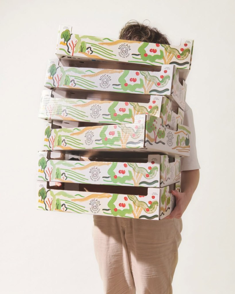
To contrast the clean, structured symbol, Plakton introduced a secondary visual language utilising expressive watercolours. Designed as one massive composition, the artwork is cropped into distinct fragments for various touchpoints—from packaging boxes to social media. Because of this, every piece of communication features a unique slice of the same visual universe. The symbol identifies the product on the label, while the boxes immerse the buyer in the Boscada world.
Padrés notes that while the illustrations capture the spontaneous, organic nature of the environment, the brand’s typography and layout remain intentionally restrained. This duality perfectly mirrors the product: nature is wild and spontaneous, but cultivating exceptional fruit at 1,000 metres requires immense care, experience, and precision.
For typography, the studio paired Matthieu Cortat’s warm Petit Serif with Hoefler & Co.’s Sentinel, a Clarendon-inspired slab serif. The former provides an elegant, distinct personality that ties into the brand’s emotional core without feeling nostalgic, while the latter delivers crisp clarity for longer texts and digital applications.
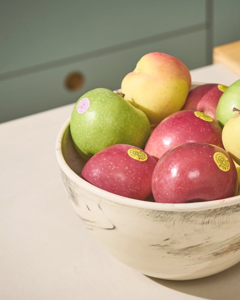
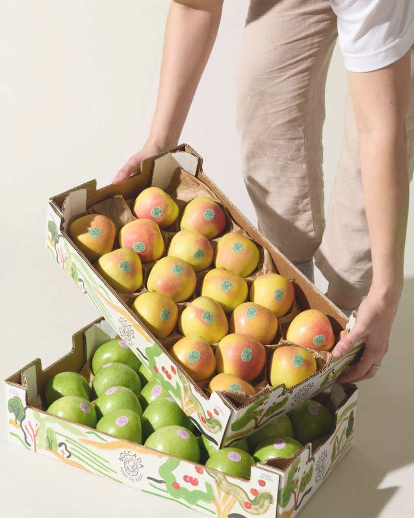
Finally, the packaging employs a functional colour system for the labels to distinguish the three apple varieties. Applied directly to the fruit, these colours were carefully calibrated to contrast with the apple skin, ensuring each variety is instantly recognisable while remaining perfectly at home within the broader Boscada aesthetic.


Leave a comment