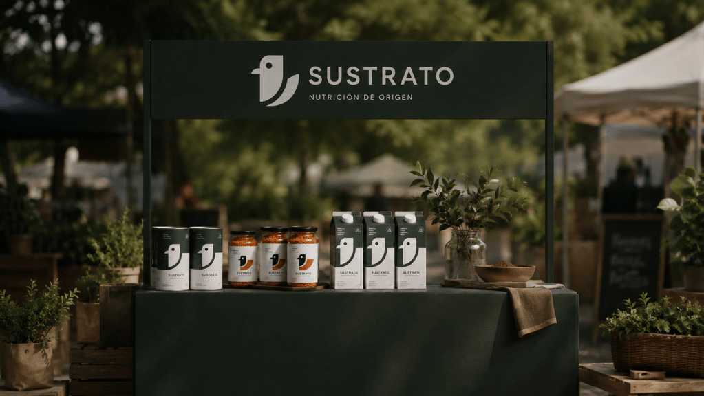
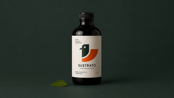
Sustrato stands out as a visual identity concept for a contemporary organic food brand, built around a simple yet powerful premise: communicating nutrition, origin, quality, and trust without relying on conventional rustic or handcrafted visual tropes. Instead, the project offers a refined and modern interpretation of natural food culture.
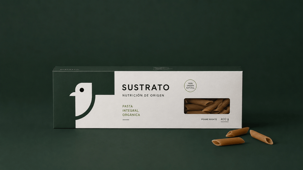
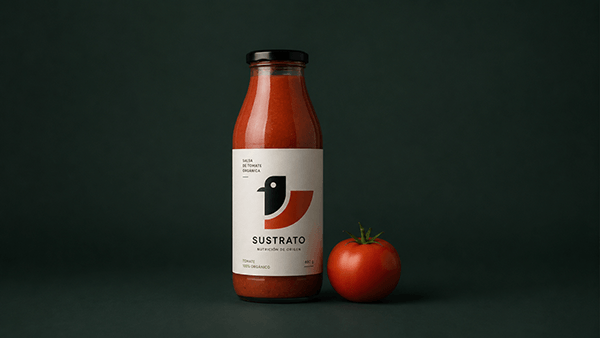
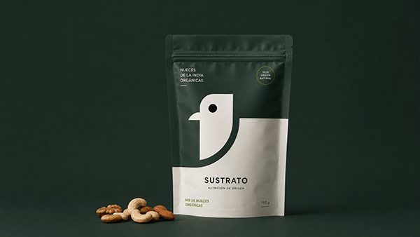
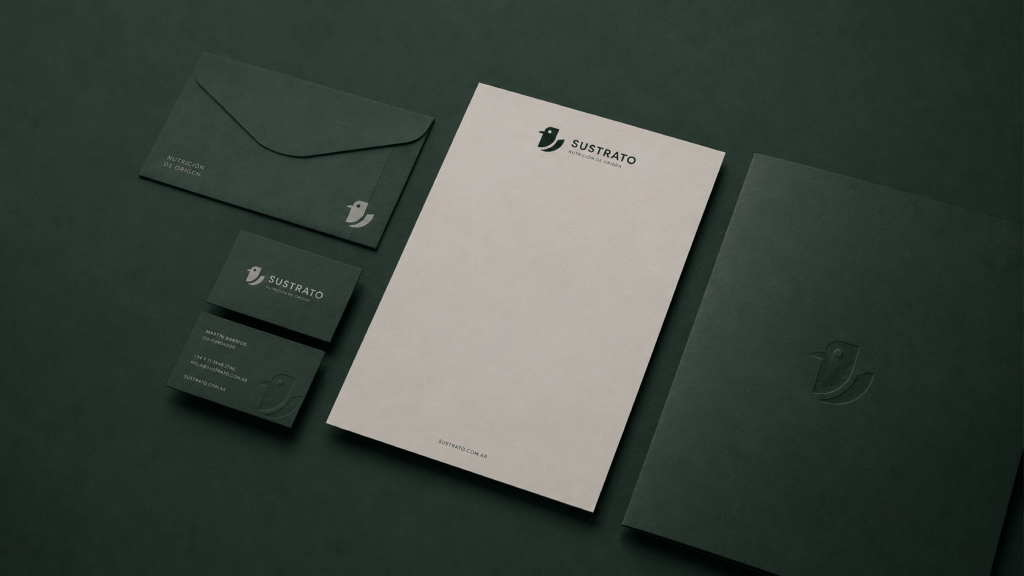
The visual system seamlessly integrates minimalist branding, functional packaging, natural materials, and a thoughtfully curated photographic style. Every element is crafted to feel intentional, authentic, and approachable, delivering a cohesive brand experience. Clean compositions, generous negative space, subtle textures, and a rich palette inspired by nature come together to create a visual atmosphere that is both sophisticated and deeply grounded.
From its packaging and print collateral to its digital touchpoints and photography, Sustrato consistently reinforces core principles of clarity, honesty, and simplicity. Ultimately, it is a brand identity designed to feel transparent, modern, and memorable—effortlessly connecting today’s consumers with the true natural origin of their food.


Leave a comment